The Problem
Handshake is a B2B ecommerce platform, and the Hub is the admin tool that allows merchants to manage their B2B business such as their orders, customers, products and online storefront.
The Hub is an admin tool that was built incrementally as new products and features were released from our product roadmap. Because of this, there was never time allocated to look at the product holistically, and this resulted in the backend system to be inefficient and confusing without hand holding from our customer success team
Goal
To enhance the overall user experience of the admin, we undertook a comprehensive approach, breaking it down into three distinct projects:
- Navigation
We prioritized refining the user journey by redesigning the navigation system. Our goal was to make it more intuitive and clear to ensure that users could easily navigate through the admin site more efficiently. - Design system
Recognizing the need for a solid and scalable foundation, we invested in establishing a robust design system. This systematic approach not only provided consistency across the admin interface but also facilitated future developments, making the system adaptable to evolving requirements. - “Quick fixes”
In addition to broader structural changes, we identified and implemented smaller, quick fixes to address immediate pain points and improve specific aspects of the admin interface. These incremental adjustments were aimed at delivering tangible improvements without compromising the ongoing user experience.
Redesigning the Navigation
Challenges
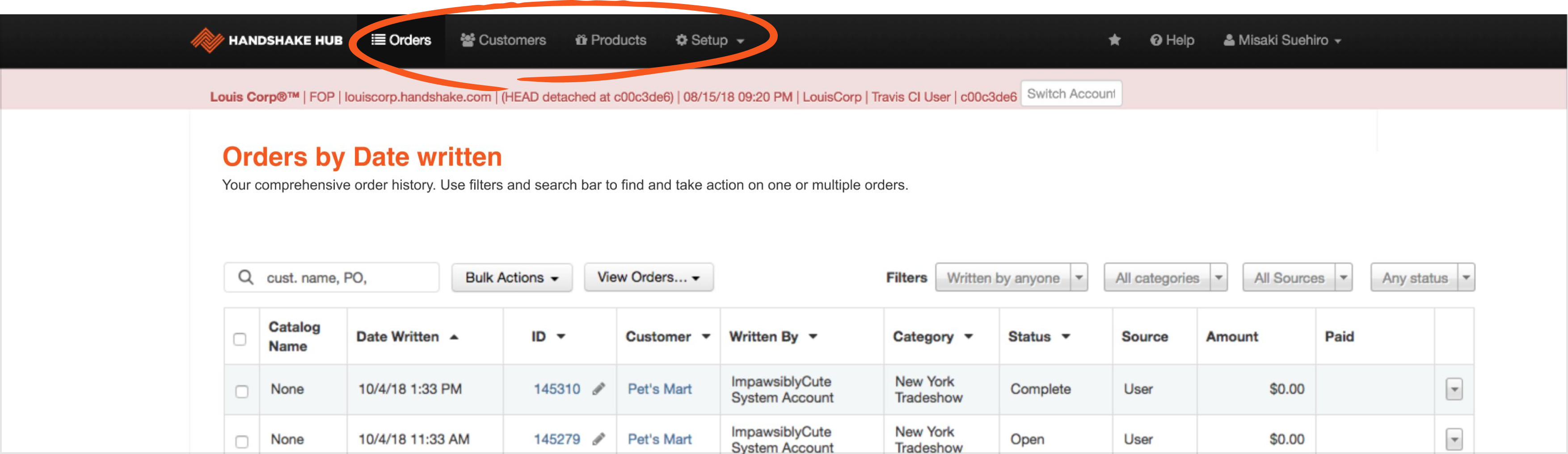
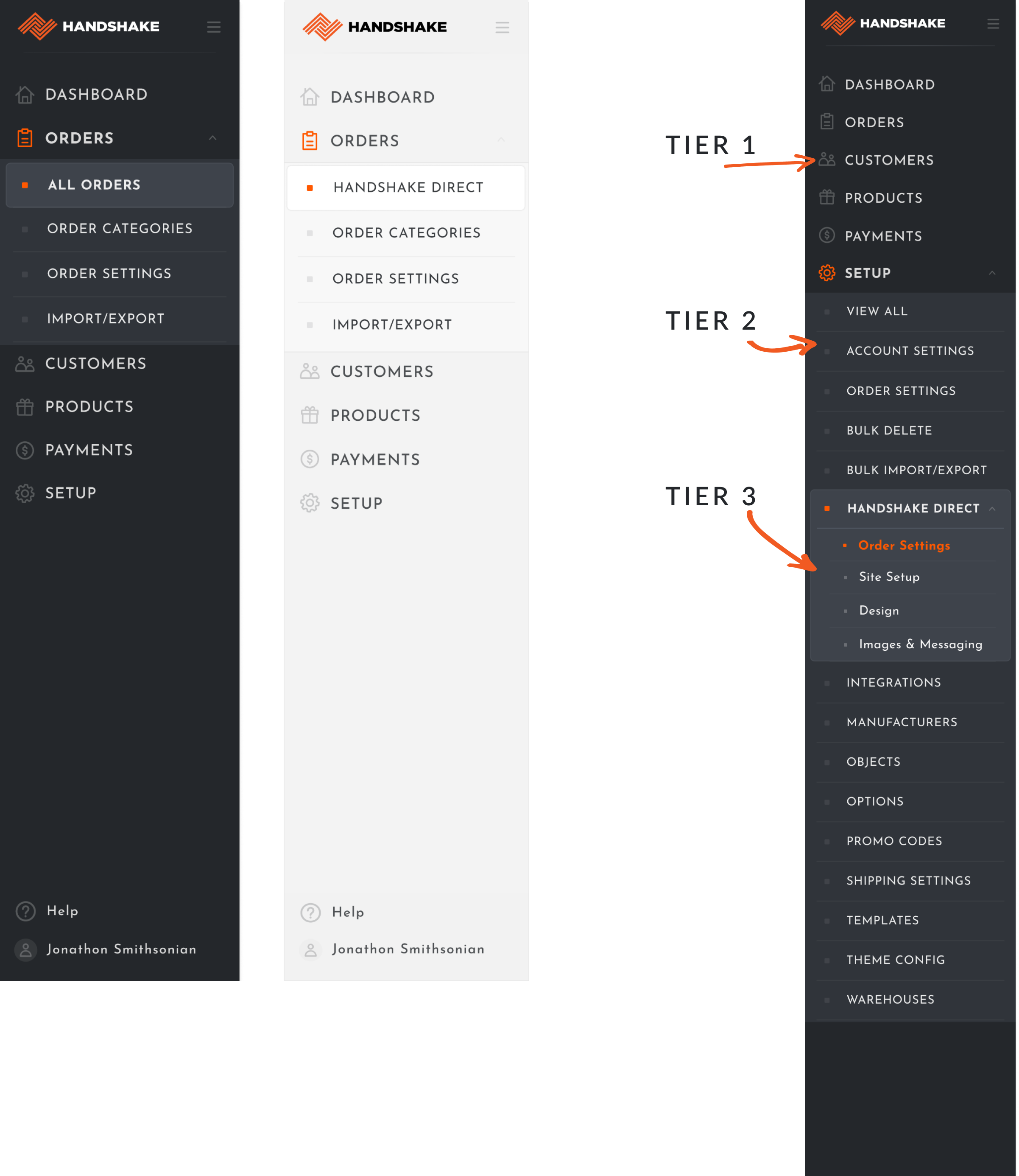
The Hub navigation featured four primary categories at the top: Orders, Customers, Products, and Setup. One issue was that Setup had evolved into a "junk drawer," accumulating various new settings pages.
Another significant challenge is that when users navigated deeper into a specific category, as the top-level navigation only highlighted the main category, making it unclear where they were in the navigation hierarchy.
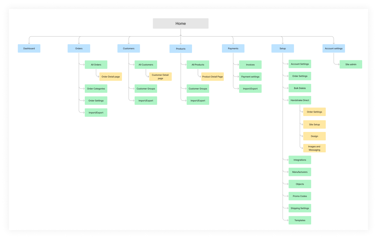
Information Architecture
I created a sitemap for the Handshake admin to get a comprehensive view of the admin’s hierarchy and pinpoint areas for improving the information architecture.
Moving to a vertical navigation
To enhance navigation, I opted for a vertical design. This is also supported by eye tracking studies that show users predominantly focus on the left half of the page (80%) versus the right (20%)
This choice offered several advantages:
- • Increased Findability: The display of more specific categories improves users' ability to find information efficiently.
- • Scalability: The vertical layout is designed to accommodate the product's growth, providing ample space for additional features and ensuring scalability as the platform evolves.
- • Efficient Scanning: In comparison to horizontal navigation, the vertical design supports quicker scanning, enabling users to swiftly grasp and navigate through available options.
- • Enhanced Awareness: The vertical structure improves user awareness as it clearly indicating their position within the navigation
Final Designs
I overhauled the navigation with a structure capable of accommodating up to three levels of hierarchy. This allowed users to navigate deeper without losing their way. To enhance user guidance, I incorporated iconography for larger categories and strategically employed spotlights of colors and highlights for visual cues.
Building a Design System
Challenges
Without standardized design components, our product lacked visual and functional cohesion, resulting in an inconsistent user experience. As our product offerings expanded, the absence of a unified design system made it challenging to scale seamlessly, leading to fragmentation and increased development time. Also, the collaboration process between design and development teams was inefficient due to a lack of a shared language and standardized assets.
Drivers
Our main drivers for implementing the design system were:
- Consistency: maintain visual and functional consistency across all products, ensuring a cohesive and unified brand identity
- Scalability: As we build more features, a design system allows for easy scalability by providing a foundation.
- Reduced Errors: by using predefined components and patterns, there's less room for errors in design and development.
- Faster Prototyping: enable rapid prototyping and iteration, allowing designers and developers to create and test ideas quickly.
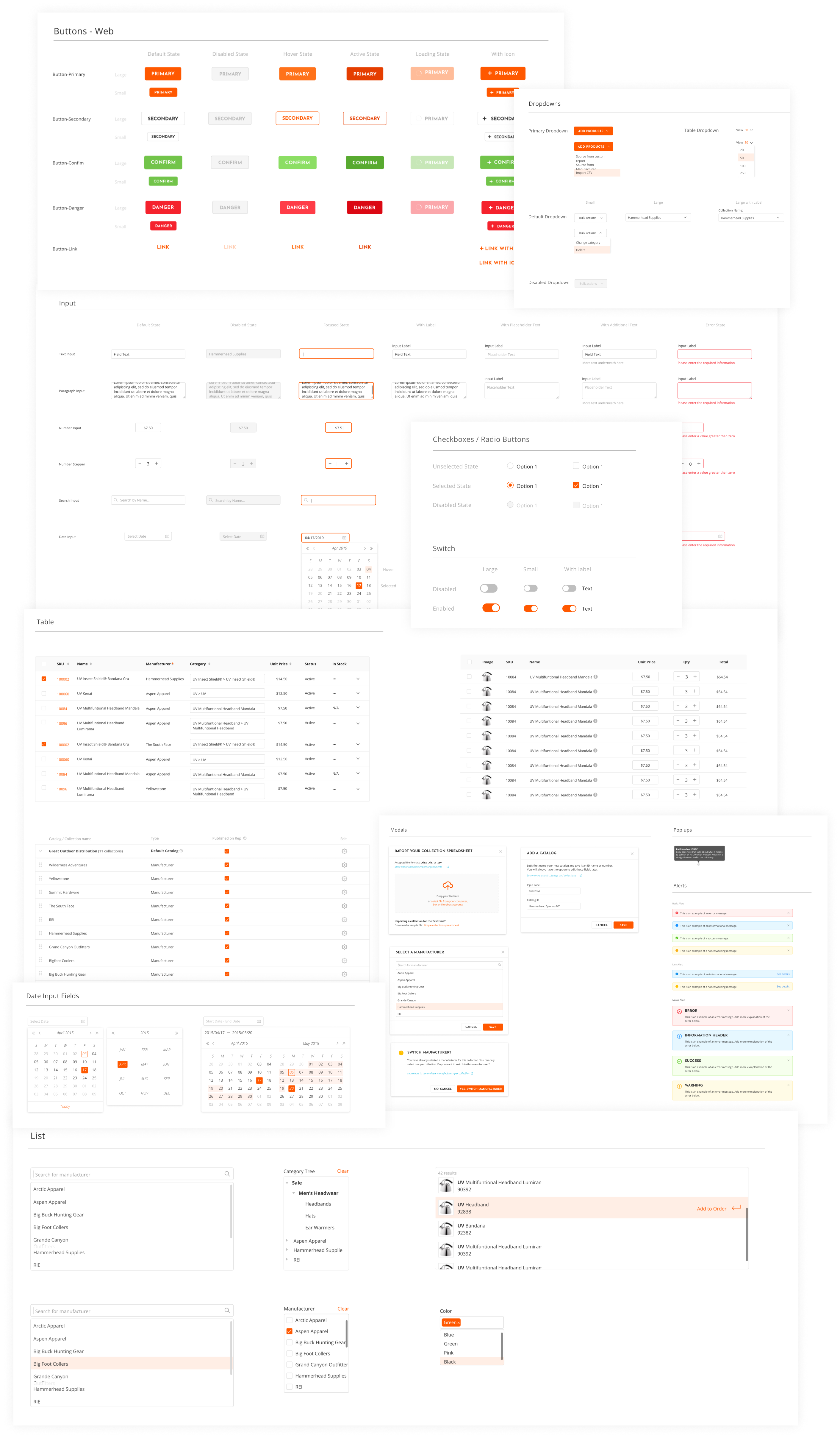
Component audit
I conducted a thorough audit of existing design components across our admin, identifying redundancies, inconsistencies, and opportunities for improvement.
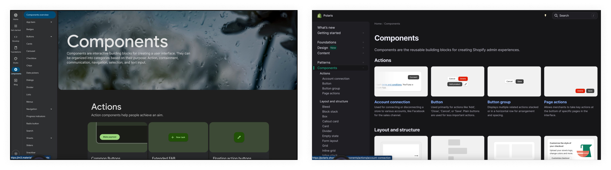
Researching industry standards
I conducted extensive research on industry best practices and emerging design trends to inform the creation of a design system that aligns with current standards and future scalability.
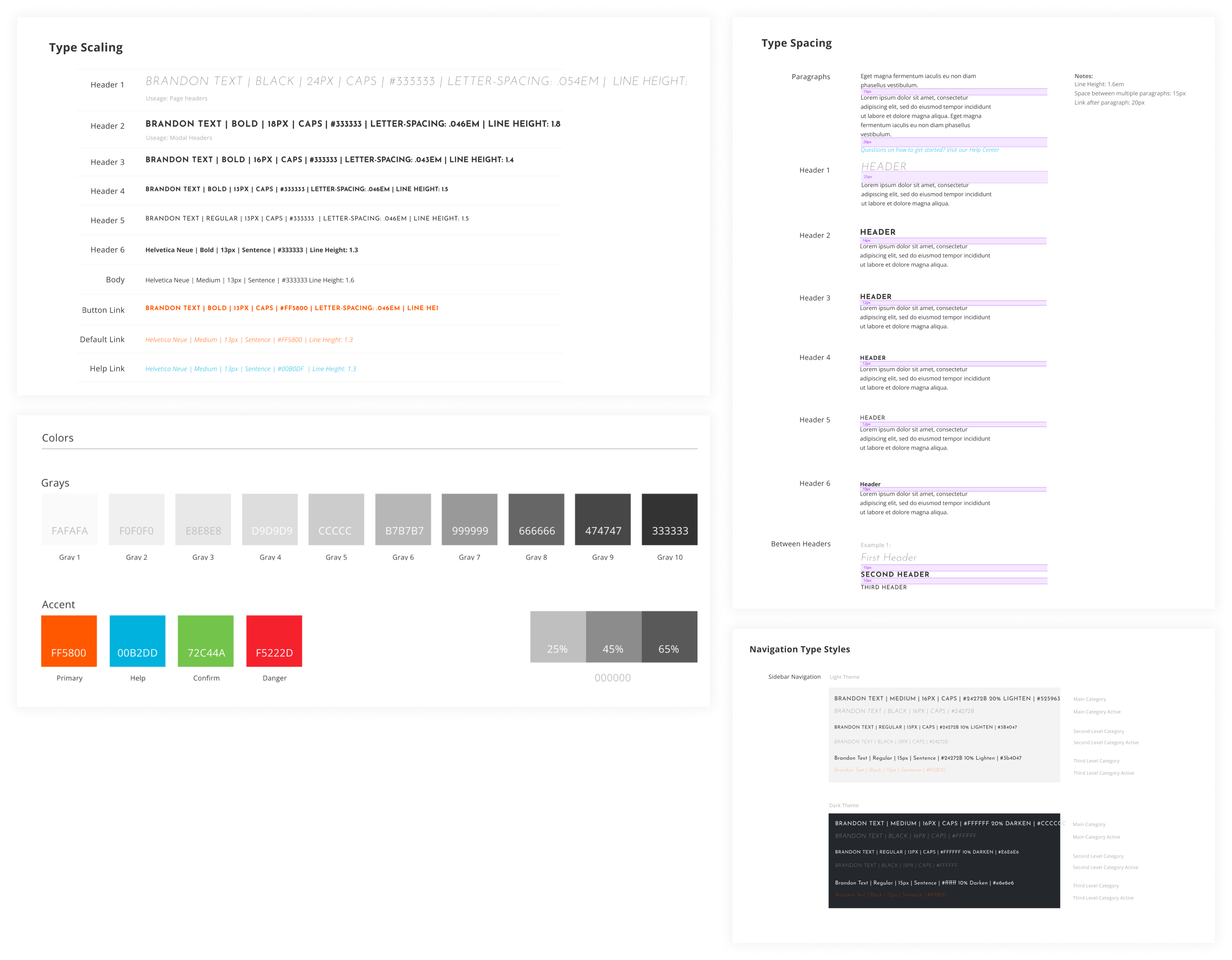
Creating a style guide
As part of the design system I created a comprehensive style guide with color palette and typography guidelines to solidify the visual and brand consistency.
Component library
I created a library of reusable UI components, such as buttons, forms, navigation, and more, ensuring consistency in design and interaction.
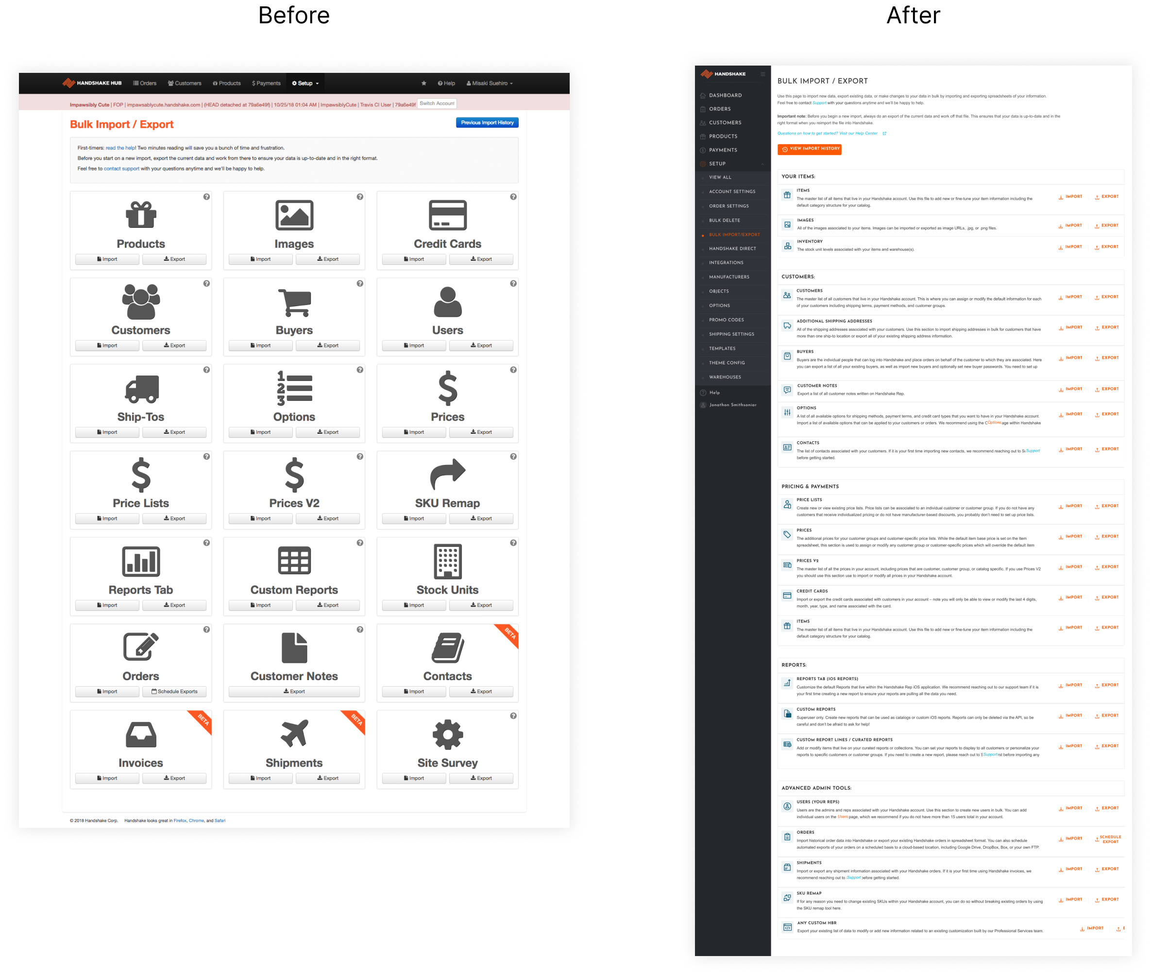
Hub Quick fixes
We created a number of “Quick fix” tickets Jira tickets to improve smaller user experience improvements throughout the admin site that were affecting the user experience. These fixes were quick win improvements to the platform alongside my main projects. They included improving content, fixing small visual elements like spacing or component inconsistencies. As the engineers started to implement more quick fix tickets, I worked on improving various pages across our site.